← WorkIdentity · Print · DigitalProleap
03 / 05 — 2025
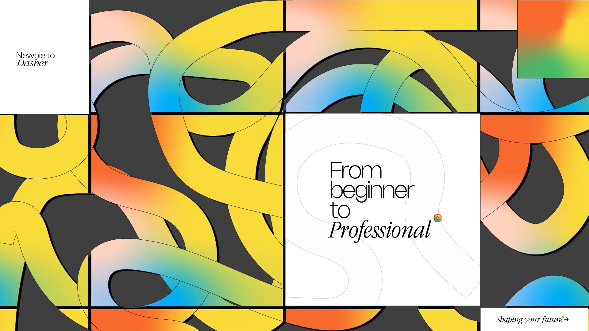
Proleap is a notebook brand with a gradient problem and no interest in
solving it politely. The identity is a single warm-to-cool shift, repeated until
it became the whole system.
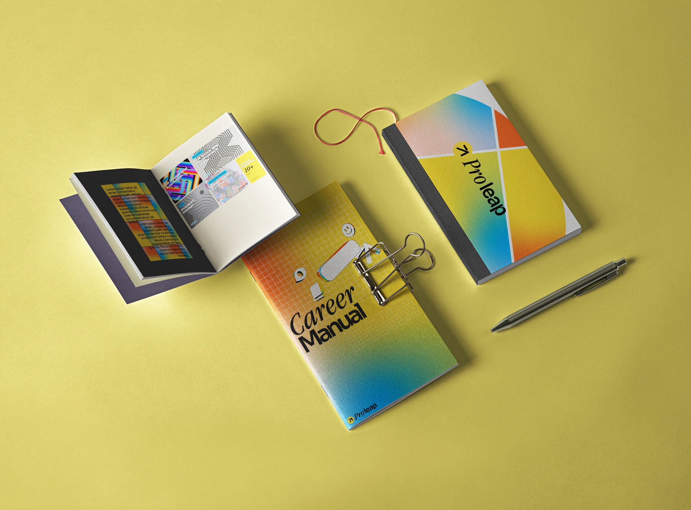
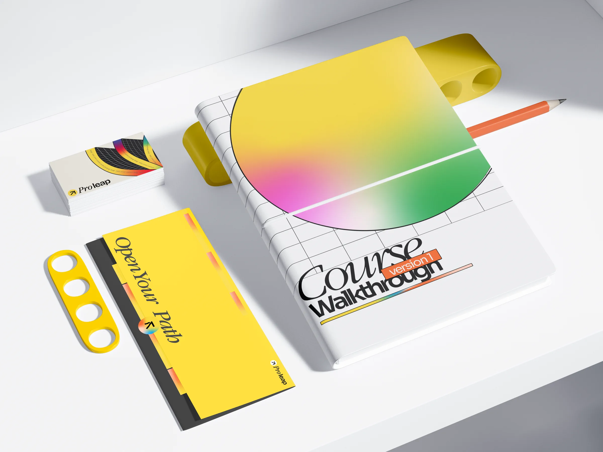
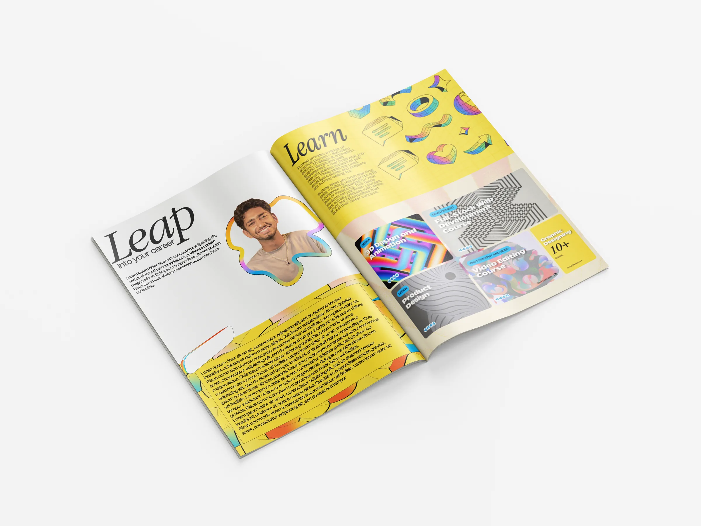
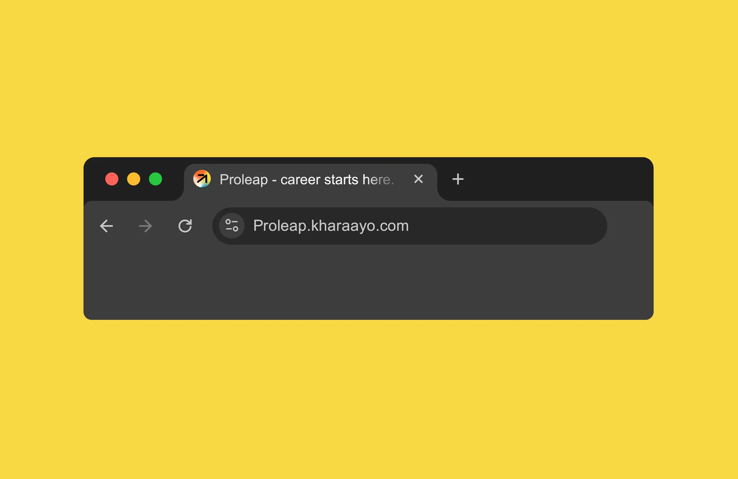
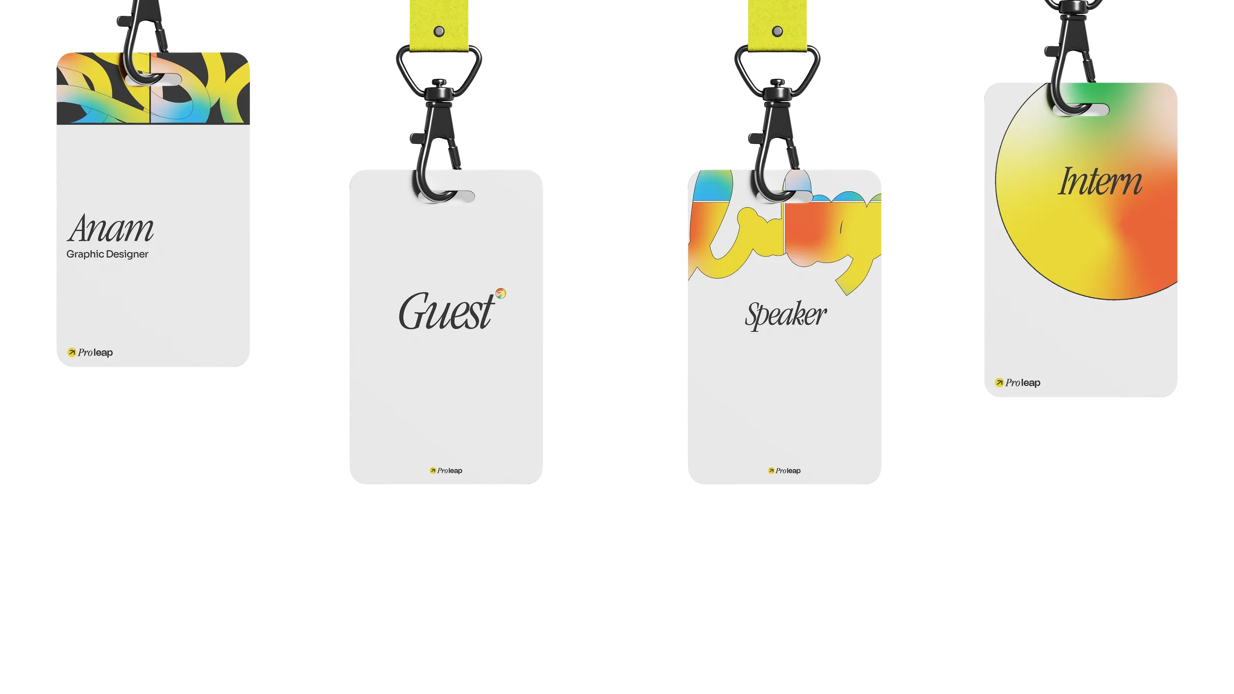
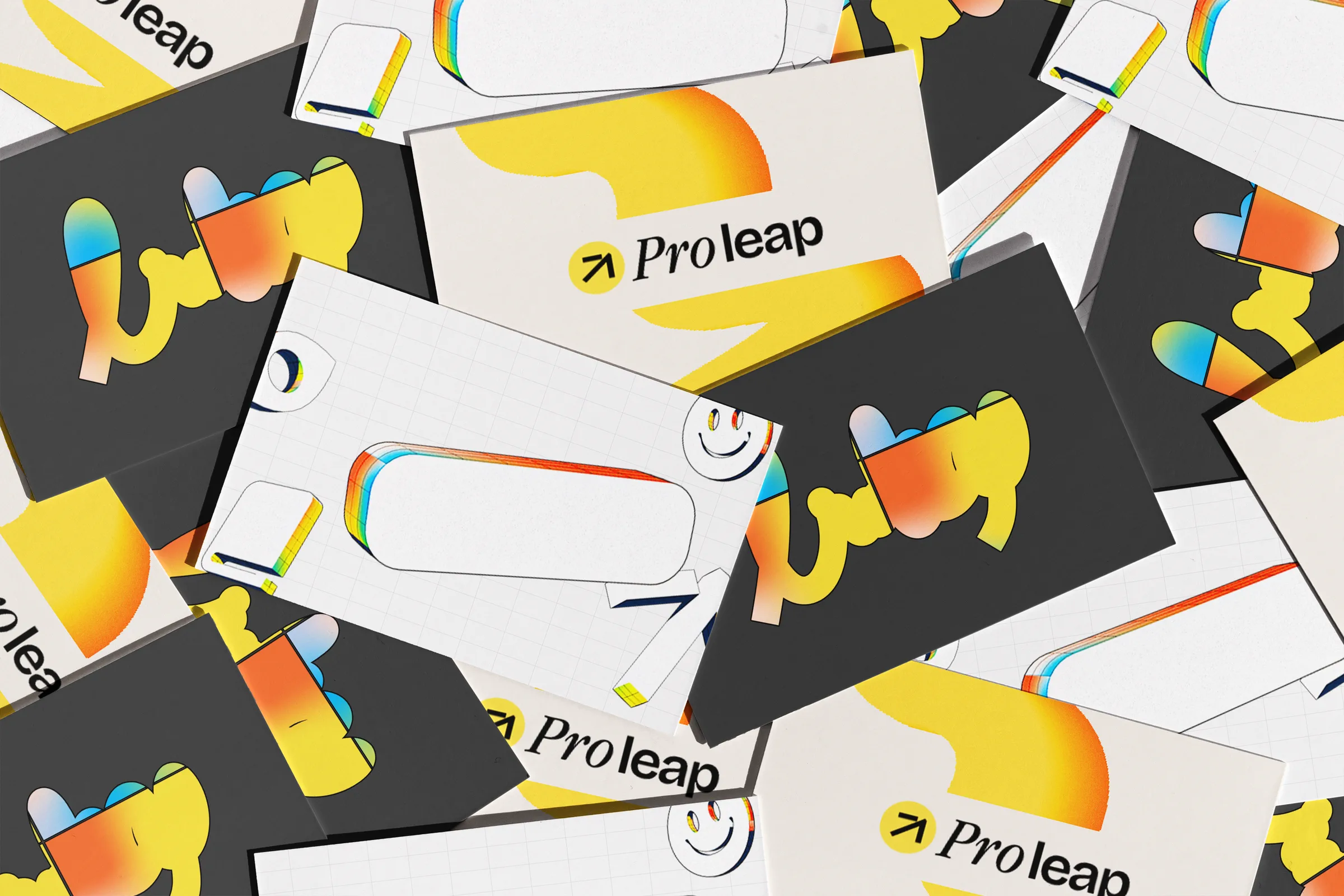
Book design, favicon, browser tab, stationery — one gradient, five
surfaces. We let the colour do the positioning and kept the type out of its
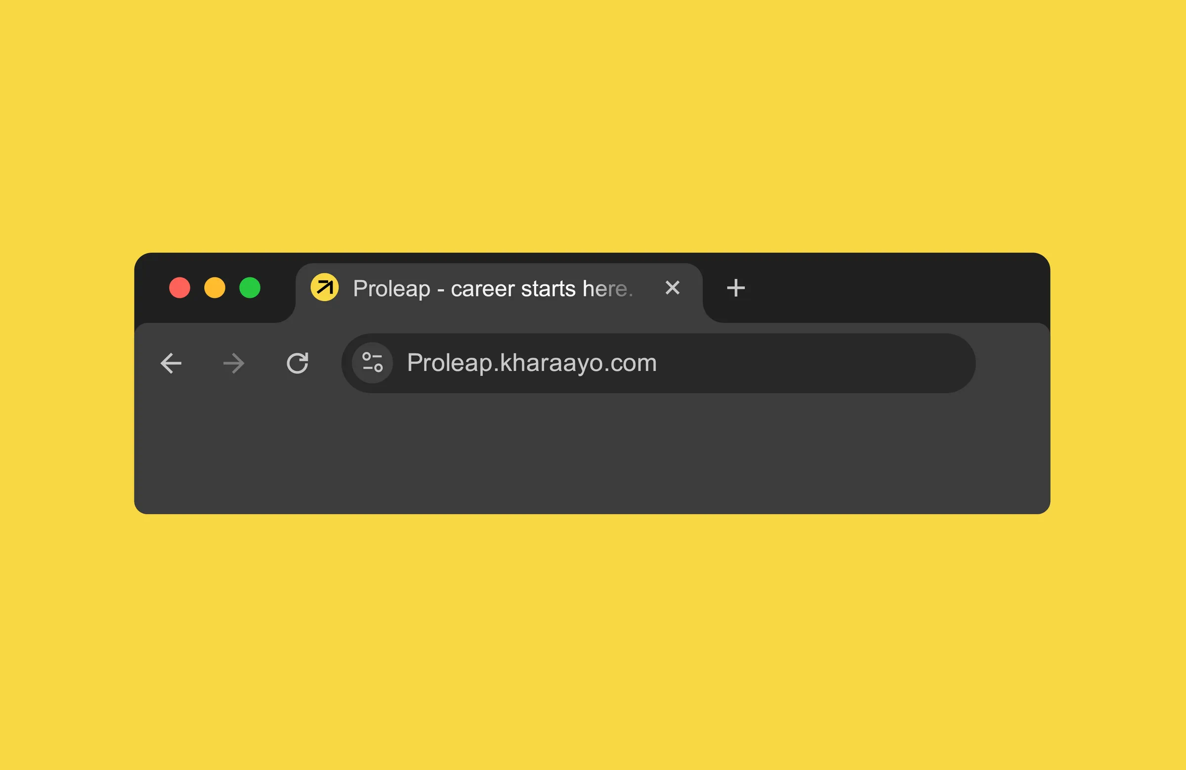
way. The tab favicon is the mark at 16 pixels, which is the only place the
gradient has to survive being tiny.
Ship the tab first. Everything else is follow-through.