← WorkBranding · Identity · PackagingCurryCorner
06 / 06 — 2026
CurryCorner is a kitchen that never drops the heat.
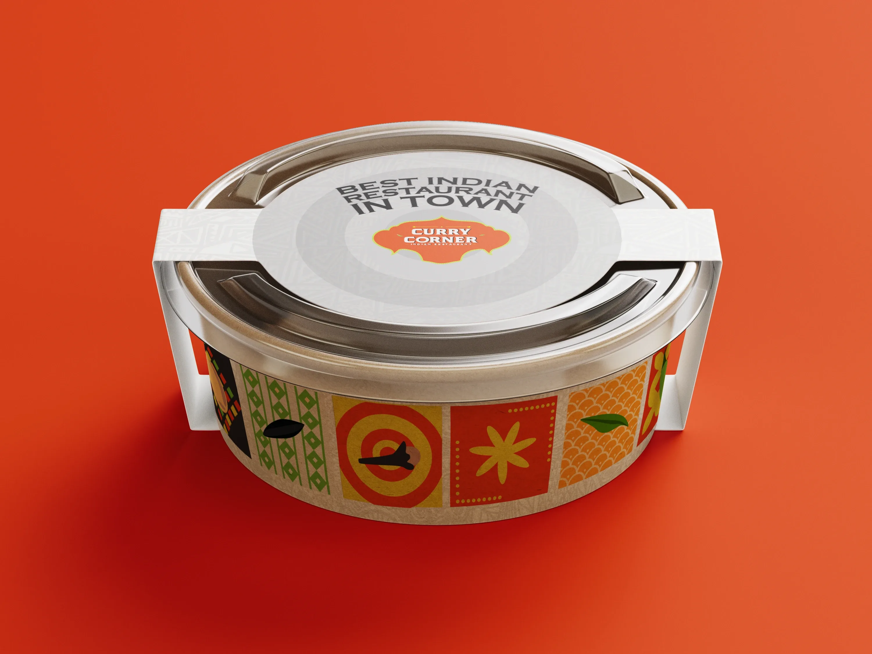
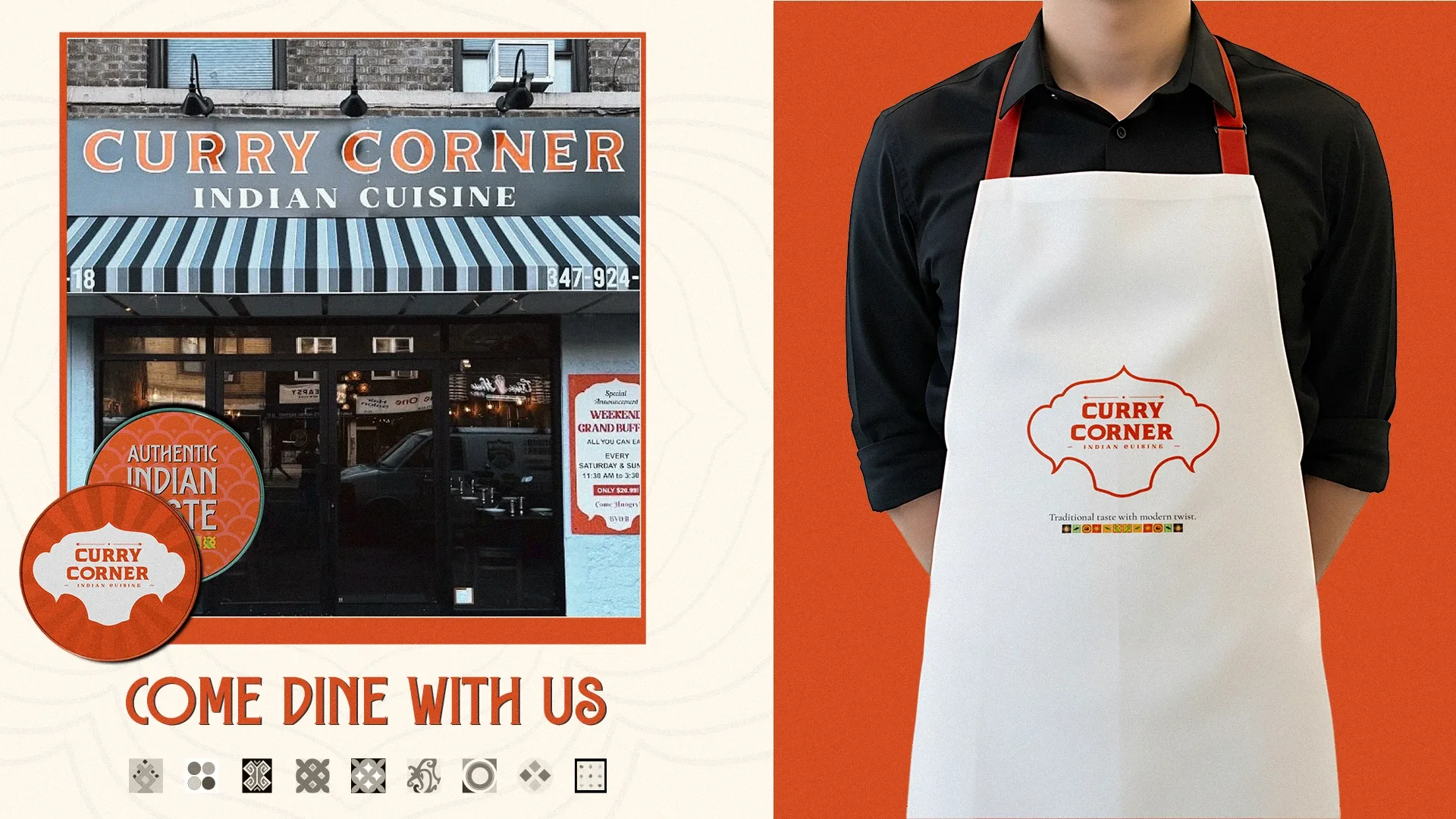
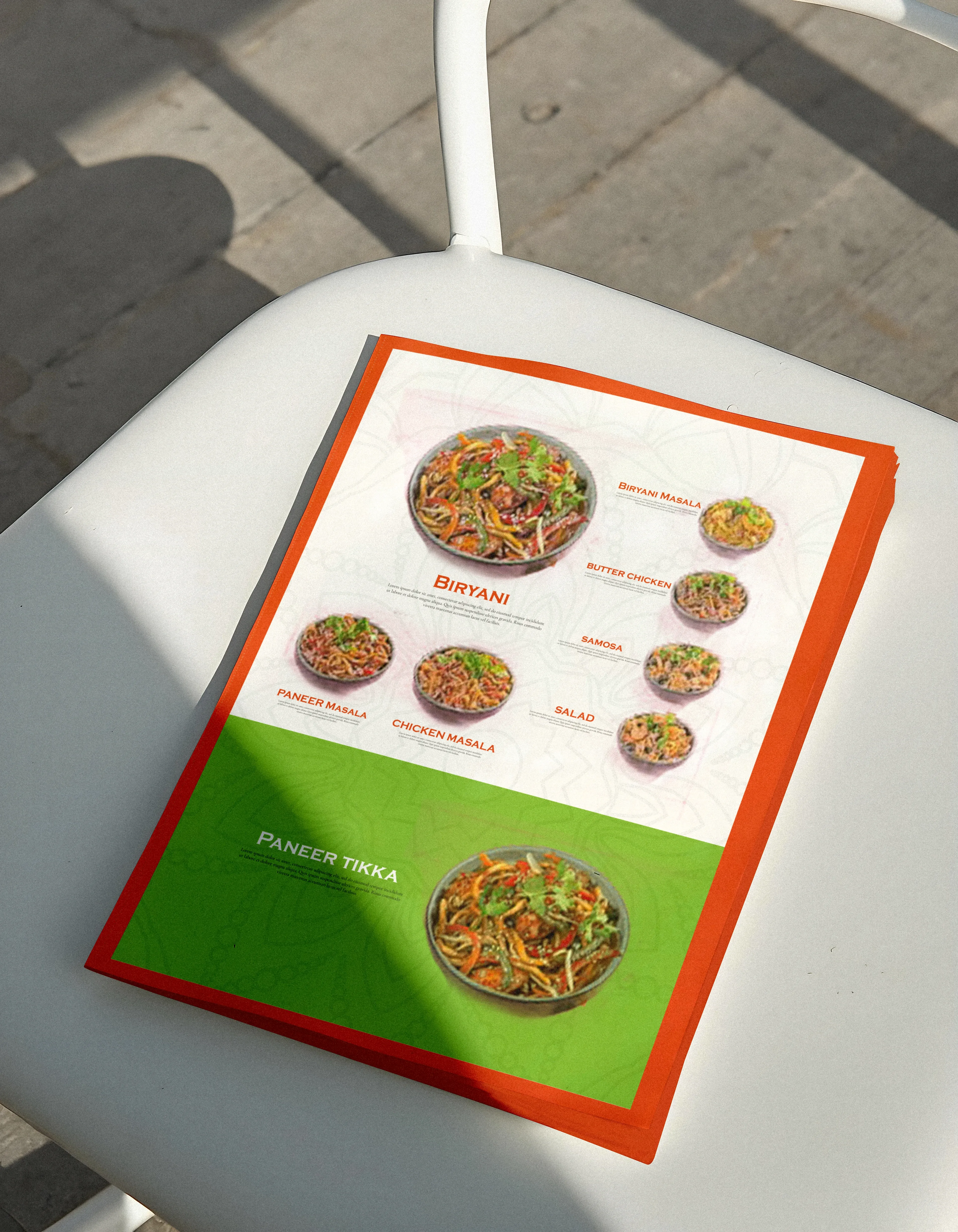
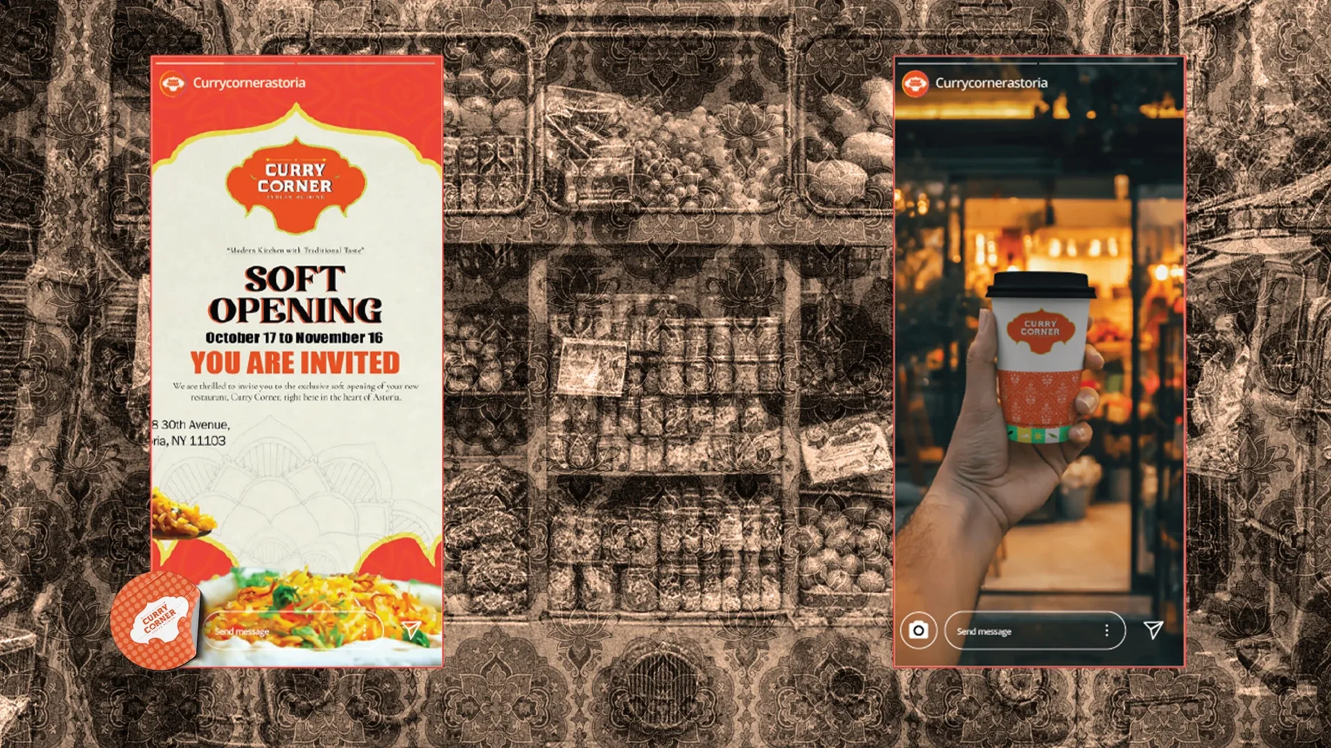
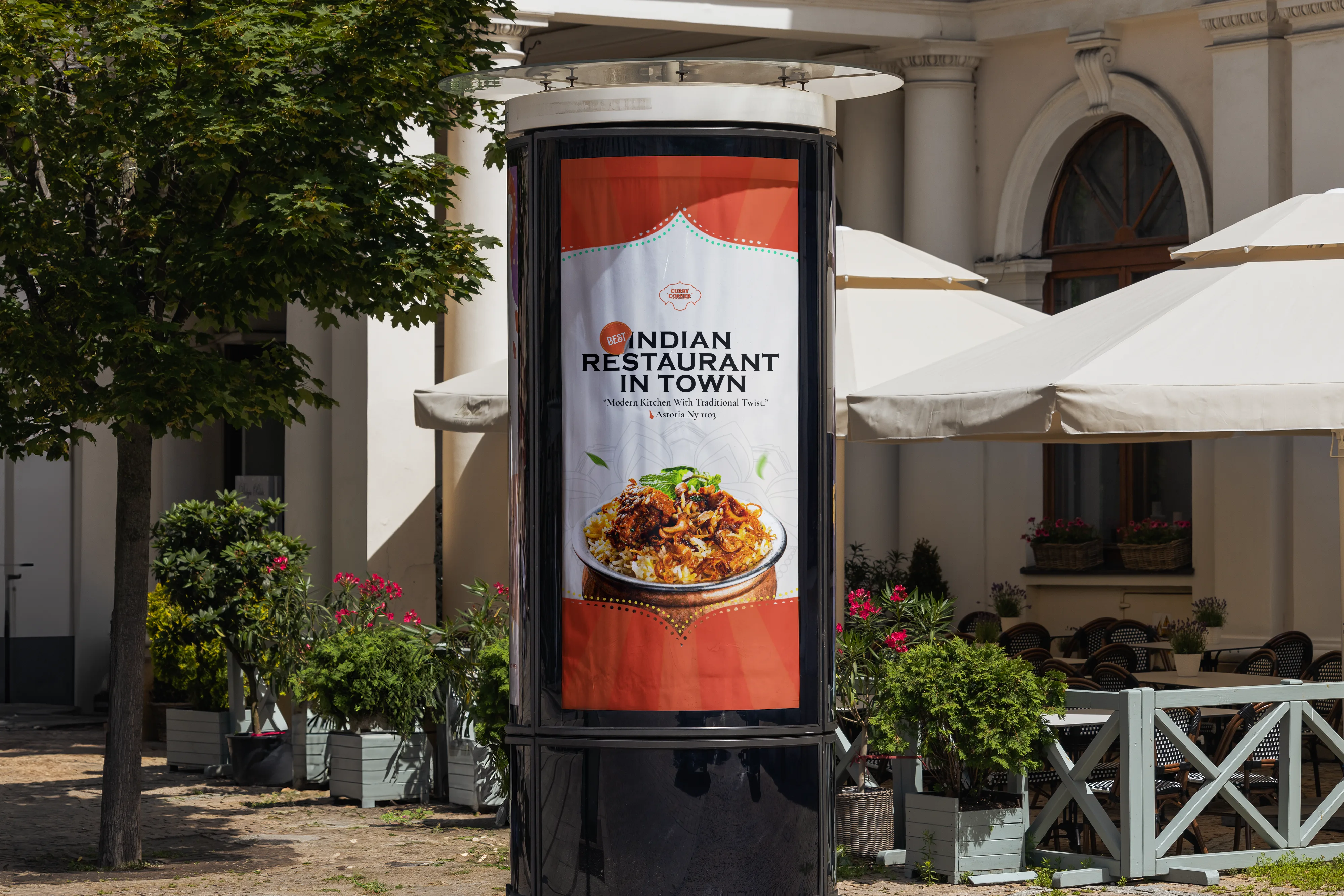
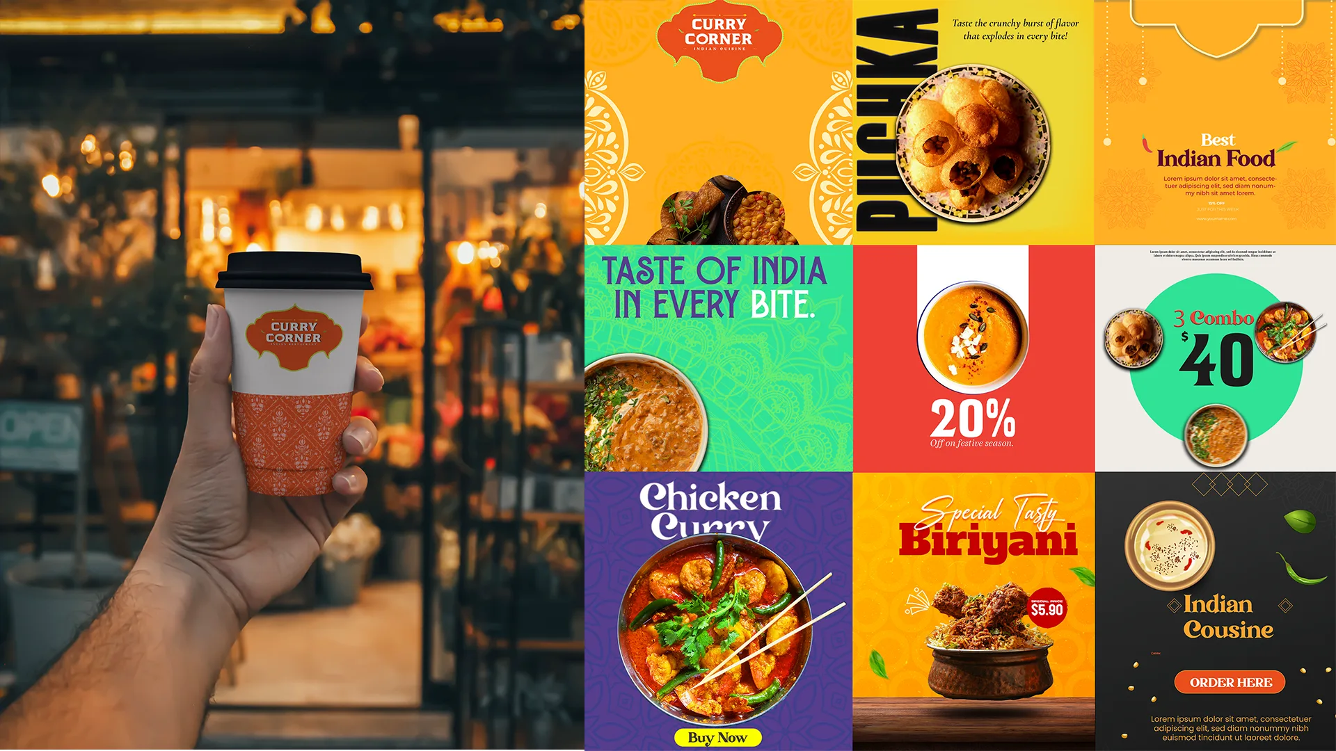
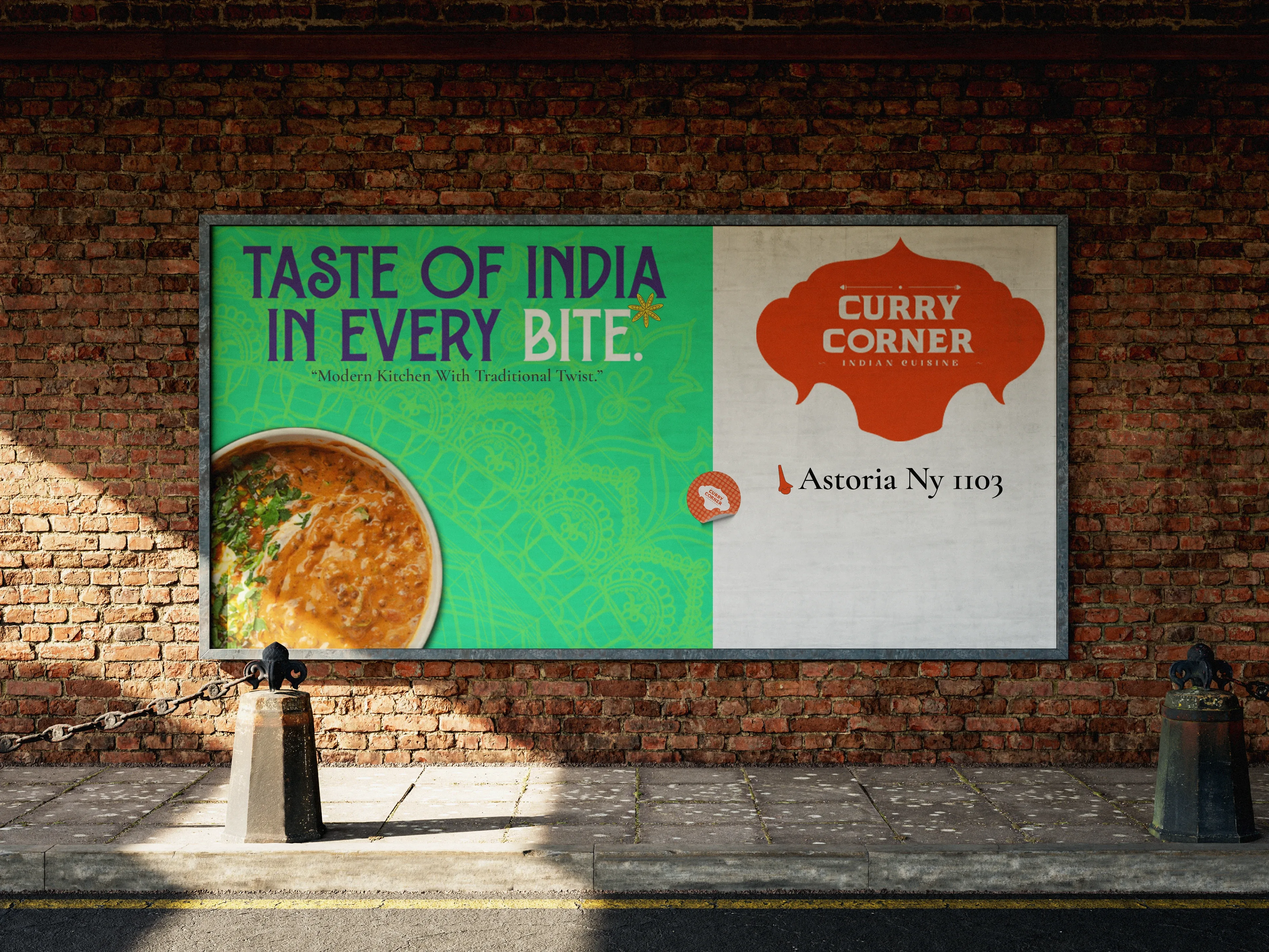
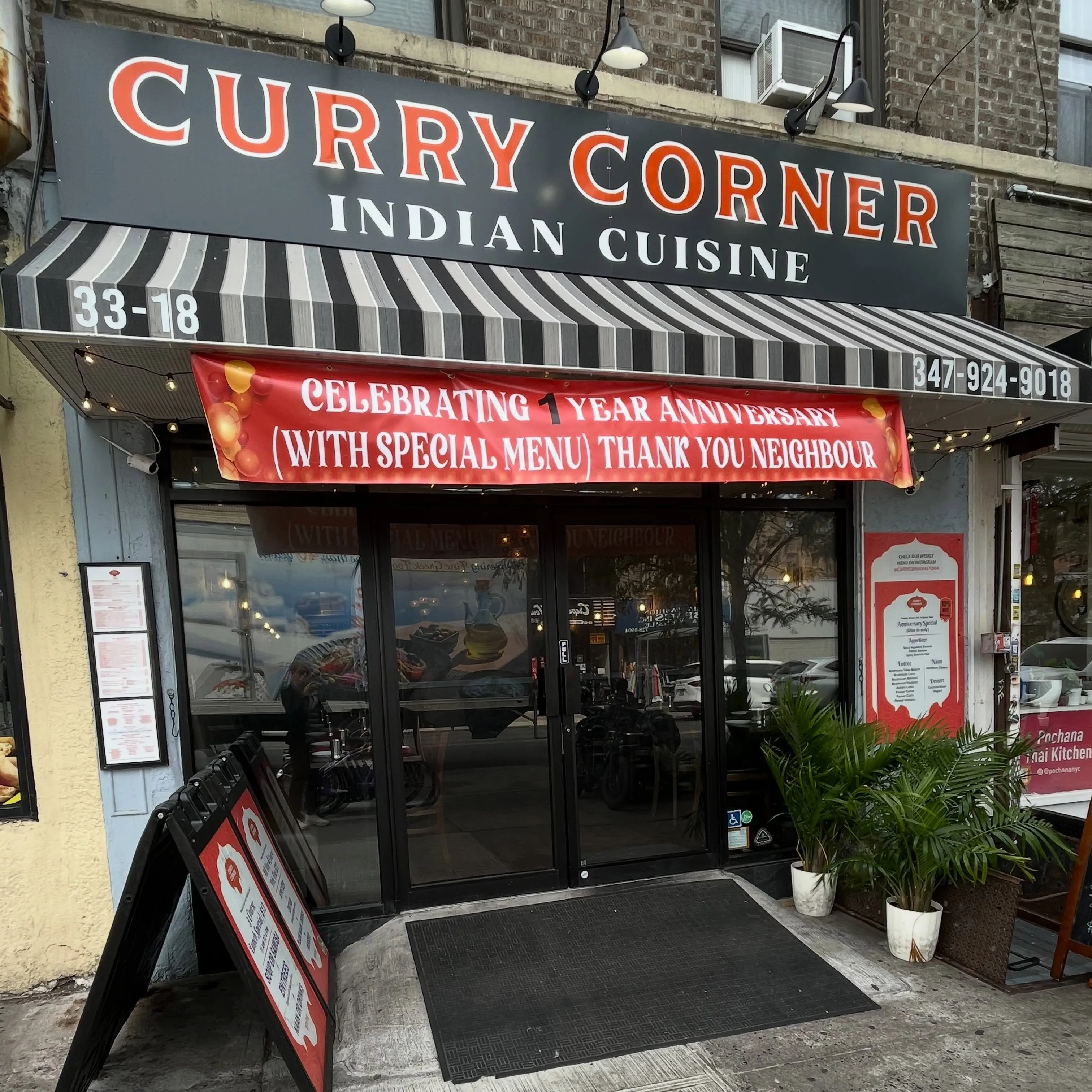
The identity runs at one temperature — menu, signage, packaging — tuned so the
brand reads as loud as the room it is standing in.
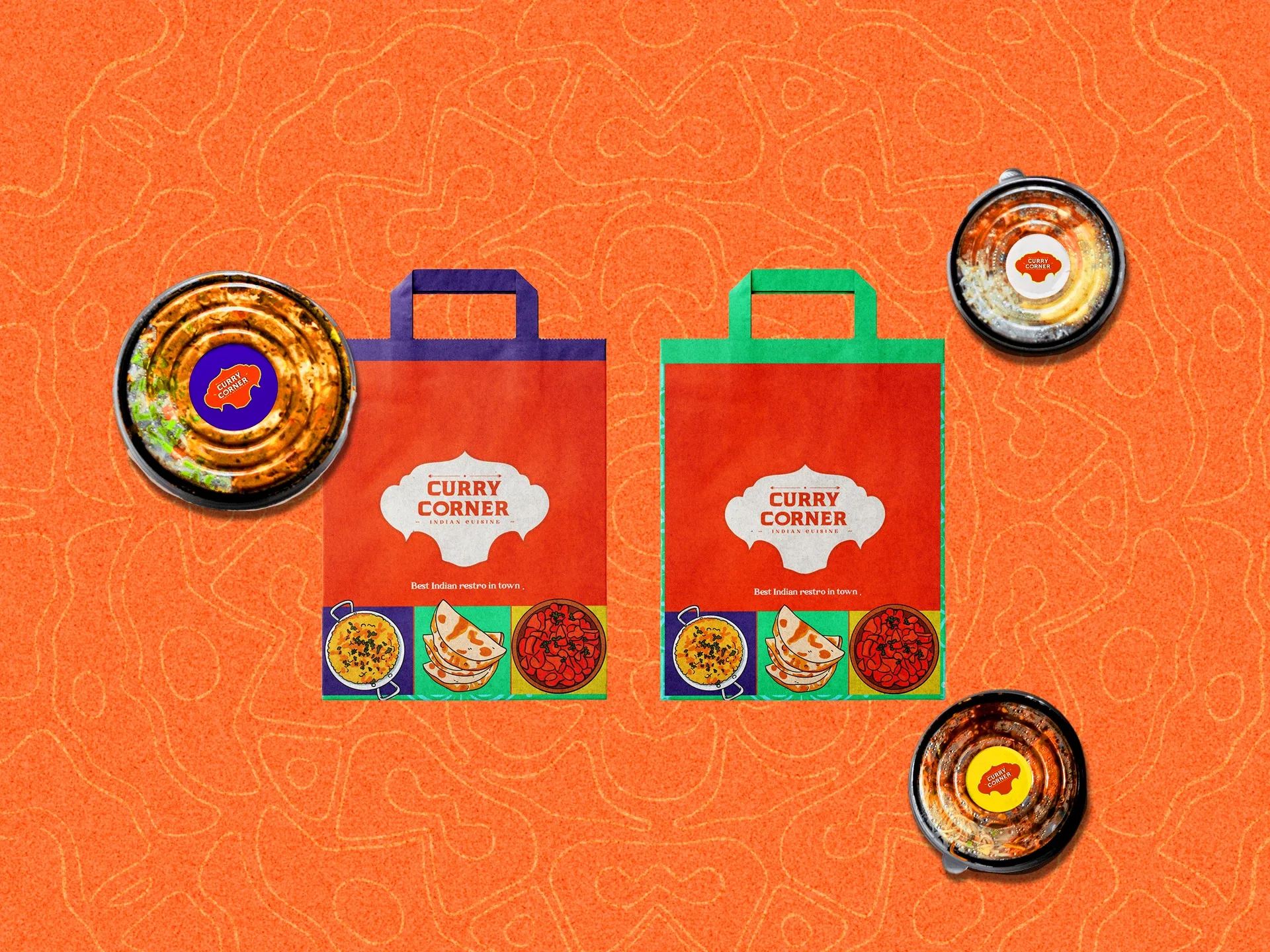
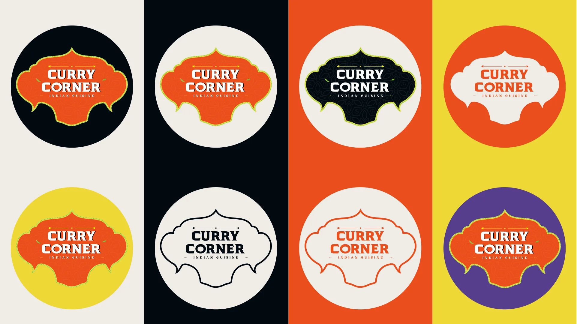
Heavy wordmark, hot palette, tight type. We built the system around a single
burn and let the colour carry the appetite, then repeated it from the menu
board to the takeaway box to the delivery thumbnail until it was one job.
Good food carries its own heat. The brand just has to keep up.